Clarity has a name.

lot-REV-ah
A coined seven-letter name for a research-materials brand that puts a material and its record in view. The two halves of the mark express that connection.
lotreva.com was available to add to cart at the checked registrar on September 11, 2026. It has not been registered. Trademark and social-handle clearance remain pending.
A considered palette.
#E4F1EF
#FAFCFB
#103E42
#254CED
#C5D8D5
#50676A
Type with room to breathe.
Manrope leads the identity, with a tight, deliberate heading treatment. DM Sans keeps body copy approachable and legible. Monospace is reserved for lot references. Use cobalt for the mark, main action, and selected state. Keep the remaining interface quiet.
The material world.
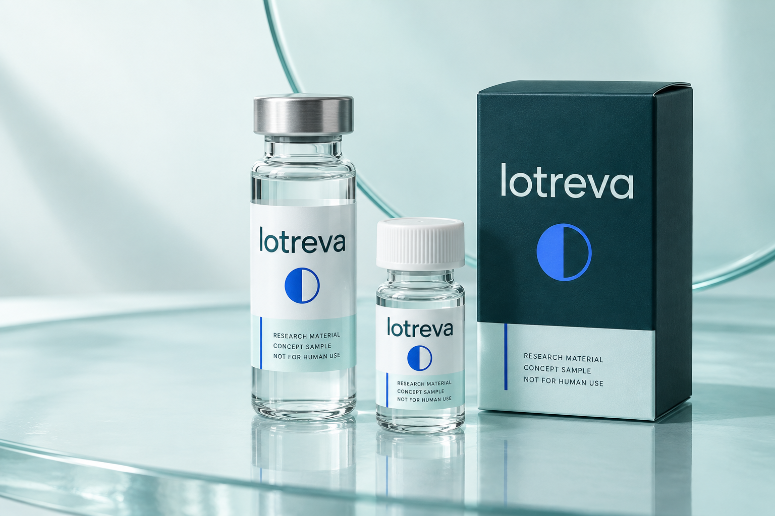
Studio imagery uses pale aqua glass, restrained reflections, petrol cartons and readable labels. This is generated concept imagery, not a photograph of manufactured inventory. No result, accreditation, or purity claim appears on the packaging.
Clear words. Specific evidence.
Describe what a buyer can inspect.
Use exact material names, accessible specifications, real lot references, authentic source documents, and operational promises that match the service.
Keep claims within their evidence.
Do not turn a purity number into a safety promise, present a concept as released stock, or imply human-use benefits. The store is intended for qualified research buyers.
Use the identity consistently.
Give the logo clear space at least the width of its circular mark. Use the petrol wordmark on paper/ice, and the light mark on petrol. Do not stretch, outline, recolor per product, add a registered-trademark symbol, or use the mark as an analytical approval seal. Keep product categories in soft background tints; do not let them replace the main brand colors.
Concept v1 · Name and identity subject to clearance. Font-based logo artwork needs final outlined production artwork and printer proofing.